Brain ensured the unfolding of the brand identity
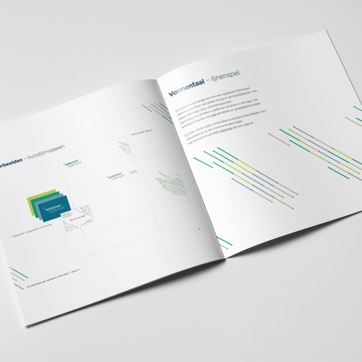
Netbeheer Nederland developed a process to forge a distinctive brand identity. Through a collaborative creative process, they created a visual language that reflects their commitment to sustainable energy and robust grid management.
Logo design
The beating heart of the Netbeheer Nederland brand lies in their well-thought-out logo design. This symbol embodies innovation and a smooth energy transition, with unique elements that convey the company's core values and leave a lasting impression on stakeholders.
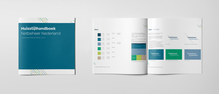
Consistent corporate identity
With an eye for detail, Netbeheer Nederland guaranteed a consistent corporate identity on all channels. From stationery to digital expressions, this consistent visual language strengthens their professionalism, with the focus on providing high-quality network management services.